Dark Mode Email Preview: What Every Email Marketer Needs to Know
Why dark mode email preview changed email marketing
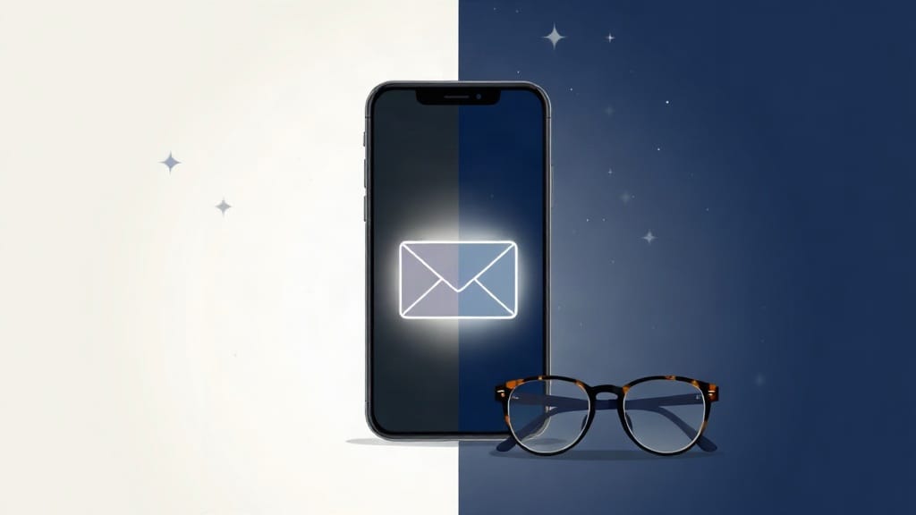
Dark mode is no longer a niche preference. Apple, Google, and Microsoft have all built dark display settings directly into their operating systems and native email clients. According to data from Android Authority, over 81% of smartphone users keep their devices in dark mode at least some of the time. That number has climbed steadily since 2019, and there is no indication it will reverse course.
For email marketers, this shift creates a specific and solvable problem. An email designed for a white background can look broken, unreadable, or even offensive in dark mode. Text disappears. Logos develop strange halos. Buttons become invisible against darkened backgrounds. If you have never run a proper dark mode email preview before sending a campaign, a large portion of your audience may be seeing something very different from what you intended.
This article examines what dark mode email preview actually involves, how major email clients handle dark mode rendering, and what steps your team should take to ensure every email looks intentional regardless of the recipient's display settings.
How email clients handle dark mode (and why they disagree)
Not all email clients treat dark mode the same way. This inconsistency is the root cause of most rendering problems, and understanding it is the first step before you can fix anything.
The three major rendering approaches
Email clients generally fall into one of three categories when a user enables dark mode on their device.
- No change: Some clients, particularly older webmail platforms, simply ignore the device's dark mode setting entirely. Your email renders exactly as coded, on a white background, even if the rest of the interface has gone dark.
- Partial inversion, where the client darkens the background of the email but leaves most of your code untouched. This is common in older versions of Outlook and some Android clients. Results are unpredictable because the client is making decisions your CSS did not account for.
- Full dark mode override, where the client actively rewrites color values throughout your email. Apple Mail on iOS and macOS does this. So does Gmail on Android in certain situations. The client essentially decides what dark means for your email, which can override your carefully chosen brand colors.
Gmail's behavior deserves special attention. Gmail uses what developers call a "color-scheme-dependent" approach. If you declare a color scheme in your email's CSS, Gmail will respect it. If you do not, Gmail may attempt to auto-darken the background while leaving foreground elements unchanged. The result is often a dark grey background with black text sitting on top of it. Completely unreadable.
The Apple Mail factor
Apple Mail has the most aggressive dark mode rendering of any major client. It applies dark mode to virtually all HTML emails when the system setting is active. Transparent PNG images often end up with visible white squares around them. Black logos on transparent backgrounds disappear entirely. This makes Apple Mail the most important client to test against when building your dark mode email preview process.
Apple Mail also supports a CSS media query called prefers-color-scheme, which means you can write specific CSS rules that only activate in dark mode. That is useful. But it requires that someone on your team knows to write it, and that your email preview testing actually checks whether it worked.
What to look for during a dark mode email preview
Running a dark mode email preview is not just about switching your phone to dark mode and glancing at the inbox. A real preview covers several specific failure points that catch teams off guard.
Text legibility
This is the most common issue. If you have hardcoded black text using color: #000000 in your email's HTML, that text will remain black even when the email client turns the background dark grey or near-black. Your subscribers will either squint or delete the email immediately.
The fix involves using system-default colors where possible, or writing explicit dark mode CSS overrides. Neither solution is difficult, but both require that someone actually previewed the email in dark mode first. Without the preview step, these problems ship.
Logo and image rendering
Logos saved as PNG files with transparent backgrounds are particularly vulnerable. A light-colored logo on a transparent background is essentially invisible in dark mode. A white logo on a transparent background disappears completely against a white rendering, but shows up perfectly in dark mode. Depending on your brand's color scheme, you may need two separate logo files or a logo saved on a solid background color.
Email clients also sometimes invert images partially, which can cause photos to look washed out or tinted. Previewing across both light and dark rendering conditions catches this early.
Button and CTA visibility
A call-to-action button with a white background and dark border can become nearly invisible in dark mode if the email client decides to invert it. Always check that your primary CTA is visible, clearly labeled, and clickable in dark mode conditions. A button that blends into the background is worse than no button at all, because it signals poor quality to the reader.
Background color behavior
Some email clients only darken the wrapper background, not the content area. Others darken everything. If your design uses nested background colors (a common practice in email design), preview testing will reveal exactly how each layer behaves in each client.
Building a reliable dark mode email preview process
For small and medium businesses, the goal is a repeatable preview process that does not add excessive time to the production cycle. This does not need to be complicated.
Step one: know your audience's clients
Before deciding which dark mode conditions matter most, look at your email analytics to understand which email clients your subscribers use most frequently. If 60% of your list opens on Apple Mail or iOS Mail, your dark mode preview must include those environments as a priority. If your audience skews toward Gmail on Android, that becomes the key test case.
Most email marketing platforms provide some level of client and device reporting. Pull that data quarterly and adjust your testing checklist accordingly.
Step two: use a dedicated email preview tool
Manual testing on your own devices is better than nothing, but it covers only the clients on hand. A purpose-built email preview tool renders your email across dozens of client and device combinations at once, including dark mode variants of each environment.
Email Preview Services offers exactly this kind of testing environment. You upload your email, run a preview across the full client matrix, and see side-by-side comparisons of how your design looks in light mode versus dark mode across Apple Mail, Gmail, Outlook, and other clients. This saves hours compared to maintaining physical device libraries or emulator setups, and it gives your team a shared visual reference before any campaign ships.
The ability to catch a dark-mode rendering failure on a Thursday afternoon before a Friday send is genuinely valuable. The cost of a broken email reaching tens of thousands of subscribers is hard to quantify, but it includes damaged brand credibility and a lower chance that those recipients open the next email.
Step three: add dark mode CSS
Once you understand where your rendering problems occur, the fix usually involves writing a @media (prefers-color-scheme: dark) block in your email's <style> tag. Inside that block, you specify alternative colors for text, backgrounds, and borders that work on dark backgrounds.
Here is what this looks like in practice:
- Set your main content background to a dark color, such as
#1a1a1a, so you control what the reader sees rather than leaving it to the client's algorithm. - Change body text from
#000000or#333333to a light grey like#e0e0e0so it remains readable. - Update link colors from standard blue to a lighter, accessible variant that has adequate contrast on dark backgrounds.
- Swap logo images using the
<picture>element with aprefers-color-schememedia condition, so dark mode users see a light version of the logo while light mode users see the standard version. This approach works in Apple Mail and is a clean solution to the logo disappearance problem.
After making these changes, run another dark mode email preview to confirm the overrides are working as intended across your priority clients. This iterative approach catches edge cases before they reach subscribers.
Step four: make dark mode review part of your QA checklist
The most effective organizations treat dark mode review as a standard checkpoint, not an optional add-on. Add a dark mode preview step to your campaign approval workflow. Whoever signs off on an email before it sends should include explicit confirmation that the dark mode rendering was reviewed and acceptable.
This one procedural change eliminates most dark mode failures because it removes the assumption that someone else checked it.
Common design mistakes that make dark mode worse
Several recurring design habits create dark mode problems that are entirely avoidable.
- Using purely white backgrounds with no explicit color declaration. If you do not set a background color, clients will pick one for you.
- Embedding images that contain light-colored text on transparent backgrounds. These look fine in light mode and are unreadable in dark mode.
- Relying on image-only emails to avoid rendering complexity. Images often get partially inverted or desaturated in dark mode, and there is no CSS override that can fix a JPG.
- Using inline styles exclusively and skipping the
<style>block. Dark mode CSS overrides require a style block. Emails built entirely with inline styles have no mechanism for responding to theprefers-color-schememedia query.
The business case for investing in dark mode preview testing
Marketing departments sometimes treat dark mode preview as a nice-to-have, something to address when there is extra time in the production cycle. This is a miscalculation.
Consider what happens when a campaign sends with broken dark mode rendering. Recipients who see an unreadable or visually broken email do not usually report the problem. They simply do not click. Or they unsubscribe. Or they mark the email as spam. Each of those outcomes has a measurable negative effect on deliverability and future campaign performance.
Email marketing, done well, consistently delivers strong returns on investment. That ROI disappears quickly, however, if a meaningful segment of your audience is receiving a broken experience every time you send. Dark mode rendering failures are silent. They do not generate error reports. They just quietly reduce performance metrics, and without preview testing, the cause is nearly impossible to diagnose.
For small and medium businesses especially, every campaign needs to perform. There is typically less budget to absorb the impact of a failed send, and smaller lists mean each subscriber relationship carries more weight. The investment in proper dark mode email preview testing pays for itself by protecting the quality of the subscriber experience you have worked to build.
Getting started with dark mode email preview today
Start by auditing your most recent campaign. Open it in Apple Mail on an iPhone set to dark mode, then check it in Gmail on an Android device set to dark mode. What you see may surprise you.
From there, set up a preview testing process using a tool that covers the full range of clients your audience actually uses. Email Preview Services provides rendering previews across the client environments that matter most to your list, including dedicated dark mode views that show exactly what your subscribers see.
Adjust your email templates based on what the previews reveal, add prefers-color-scheme CSS overrides for the most important elements, and make dark mode review a standard step in your pre-send checklist. The entire process can be set up in a single production cycle. After that, it becomes routine, and routine is how professional email programs protect their deliverability and engagement metrics over time.
Dark mode is not going away. The subscribers who use it are not going to switch back to light mode to make your emails easier to design. The most practical response is to build dark mode preview testing into your standard workflow and stop treating it as an edge case.